Packaging trends shift more slowly than fashion trends, but they do shift, and small businesses that keep an eye on where design is heading tend to look more current and more competitive against larger, established brands. This year, several clear patterns have emerged across packaging for food, beauty, clothing, and gifting businesses in Pakistan and internationally. None of these trends require a massive redesign budget, which makes them especially relevant for small and growing businesses trying to compete visually without competing financially against bigger players.
Minimalism Continues to Win
Cluttered packaging with multiple fonts, competing colours, and excessive text has been steadily losing ground to clean, minimalist designs built around a single strong visual element, usually a logo, a signature colour, or a simple pattern. Minimalist packaging photographs better for social media, feels more premium on a shelf, and is often cheaper to print since it typically uses fewer colours and simpler layouts.
For small businesses, minimalism is also a practical advantage. A simple, well-executed design is far easier to reproduce consistently across box sizes, materials, and print runs than a complex design that requires precise colour matching every time. This consistency matters more than most business owners initially realise, since customers subconsciously associate consistent packaging with a more established, trustworthy brand.
Sustainable and Recyclable Materials
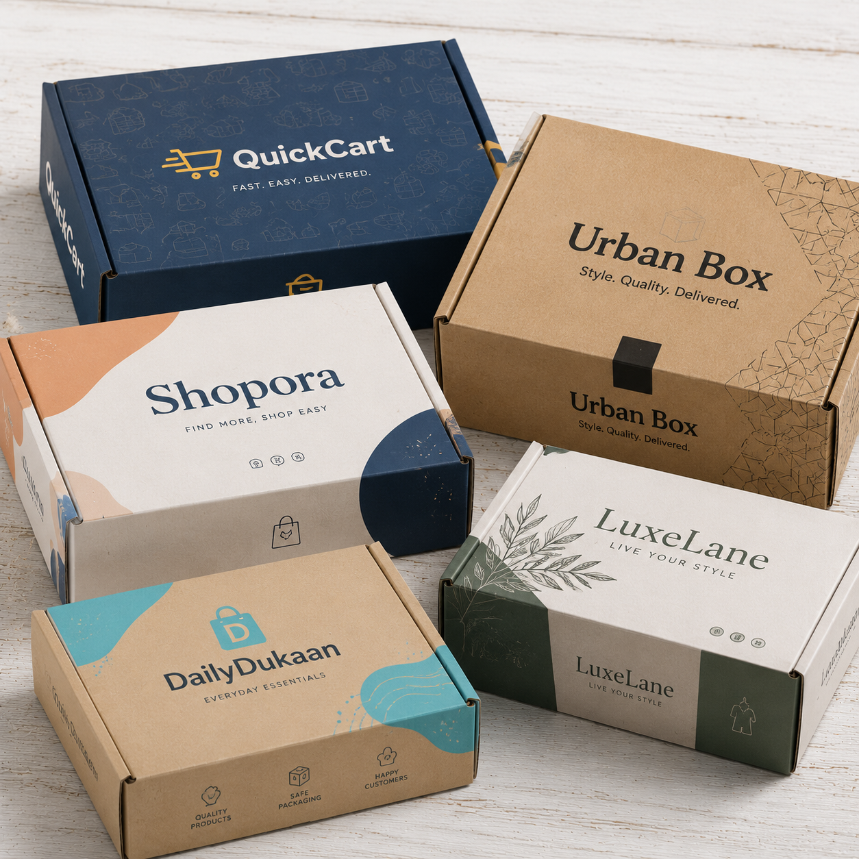
Customer awareness around packaging waste has grown significantly, and businesses that use recyclable or biodegradable materials are increasingly calling that fact out directly on their packaging. Kraft paper, recycled cardboard, and paper-based tape have all seen increased demand as businesses shift away from plastic-heavy packaging, both for environmental reasons and because sustainable packaging has become a genuine point of differentiation with customers.
- Kraft and recycled cardboard boxes instead of laminated or plastic-coated alternatives
- Paper tape instead of plastic packing tape
- Reusable fabric pouches instead of single-use plastic bags
- Soy-based or water-based inks for a lower environmental footprint
This shift does not mean every business needs to overhaul its entire packaging system immediately. Even small changes, like switching from plastic tape to printed paper tape, signal environmental awareness to customers without requiring a full redesign.
Bold Typography as the Main Design Element
Rather than relying heavily on illustrations or graphics, many small brands are using large, confident typography as the primary visual element on their packaging. A brand name printed boldly across a box, sometimes with no logo mark at all, has become a recognisable aesthetic across food, beverage, and lifestyle packaging. This approach works particularly well for businesses with a strong, short brand name, since it turns the name itself into the design.
Typography-led packaging is also relatively low-cost to produce, since it typically requires fewer print colours than illustration-heavy designs, while still standing out strongly against more traditional, cluttered competitor packaging on a shelf or in a delivery photo.
Personalised and Small-Batch Details
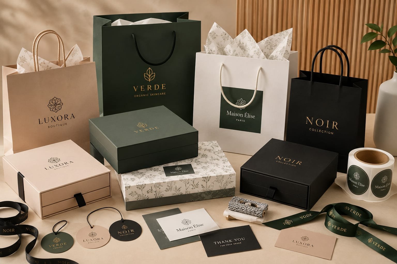
Handwritten-style thank-you notes, individually numbered packaging, and small customisation touches like a customer's first name printed on a tag have become popular ways for small businesses to signal that an order was not simply pulled off a mass-production line. These details are inexpensive to add but create a strong sense of personal attention, which is particularly valuable for businesses competing against larger, more impersonal brands.
- Printed thank-you cards included inside the package
- Custom ribbon or twine tied by hand rather than machine-applied
- Small batch numbering on labels for limited-edition products
- Personalised name tags for gifting and corporate orders
Colour Blocking and Bold Contrast
Where minimalism keeps designs simple, colour blocking uses bold, contrasting colour combinations to make packaging visually distinct even from a distance. This trend works especially well for brands targeting a younger audience, where standing out on a crowded social media feed matters as much as standing out on a physical shelf. Two strong contrasting colours, applied cleanly across a box or bag, can create a distinctive look without needing complex illustrations or photography.
Applying These Trends Without Overspending
The businesses that benefit most from these trends are not necessarily the ones with the biggest budgets, they are the ones that pick one or two trends that suit their brand and apply them consistently. A bakery adopting kraft paper packaging with bold typography, for example, does not need illustrations, foil stamping, or multiple print colours to look current and intentional. Consistency and restraint often outperform trying to incorporate every trend at once.
As you plan your next packaging order, consider which of these trends genuinely fits your brand identity rather than adopting all of them simultaneously. A cohesive, focused packaging design will always outperform a packaging redesign that tries to chase every trend at once.
Looking to refresh your packaging with any of these approaches? Our team can help translate a trend into a printable design suited to your product and order volume.
Ready to Get Started?
Share your requirements with our team on WhatsApp and get a fast, no-obligation quote for your order.
Get Quote on WhatsApp